


Author
Oya Canli
Date
2 September 2025
As the date approaches for the European Accessibility Act to go into effect, accessibility started to get the interest it long deserved. Profiting from the increasing interest, I would like to share some tips and tricks for accessibility, particularly for TalkBack, with some practical examples.
But first things first:
Test your app with TalkBack
TalkBack is a screen reader from Google available in device settings of most Android devices. Never used it before? Then it is time to try it. The best way of understanding what TalkBack users need and why, is to test your app with eyes closed and TalkBack on. 5 minutes of real experience would be more educational than reading a hundred articles on the subject. But heads-up: If it will be the first time you will be using it, you should first learn the shortcuts for enabling and disabling TalkBack. Otherwise it might be frustrating not being able to get out of it.
In many devices, clicking and holding volume up and down keys together is a shortcut for enabling or disabling TalkBack. On some devices you might need to first enable shortcuts from the device settings. You can also possibly set another shortcut. So please first go to device settings -> accessibility -> TalkBack, take a look around, check TalkBack shortcuts menu, check TalkBack settings… There should be a tutorial available on TalkBack settings, which is very helpful. This might also automatically start when you enable TalkBack for the first time on your device. On Pixel devices, there is also a floating button shortcut that I find very useful for developers.
Now let’s look at what we can do to improve the accessibility for TalkBack users.
contentDescription
contentDescription is the way we add labels to components. It is not unique to images, but naturally, it is more critical for images and icons, as TalkBack needs our help to better interpret these components. But that doesn’t mean we need to add content descriptions to all images! Here are some rules of thumb:
- If it is a clickable icon or image, or if it conveys an important meaning that is not explained by an adjacent text, then we should indeed add a meaningful and concise contentDescription, like “delete”, “add”, “back” etc..
- If the image is merely decorative, if there is no action attached, better to ignore the image.
- If there is already a text next to the image that depicts it, we can ignore the image and let the text explain it.
- Generic content descriptions that don’t add any value are to be avoided. Putting a content description like “image”, or “product image” to list items is more annoying then helpful.
- To ignore the image, we should pass null as contentDescription, and not an empty string “”. If it is set to null, TalkBack will ignore the item. If it is set to empty string instead, it will read it out loud as “unlabelled”.
clickLabel
When you click on a clickable item, TalkBack will tell something like “Double tap to activate”, which is good enough for most cases. But if you need to make an action more clear, you can customise that verb by changing the clickLabel of clickable modifier. For instance, if I change the onClickLabel as follows:
modifier = Modifier.clickable(
  onClickLabel = "add",
)
TalkBack will read this prompt as “Double tap to add”
Suppose we have two types of items in a list, some are articles, some are videos. Videos will have a play icon so users can differentiate them from articles. (That way, they are not surprised when media starts to play when they click, if they are in a public place, for instance.) For the TalkBack user, we can of course add a contentDescription to the play icon. But we can also customise the click label to make it more clear:
 val clickLabel = stringResource(
        if (item.type == ItemType.VIDEO) {
            R.string.watch
        } else {
            R.string.read
        }
    )
    Column(
        modifier = Modifier.clickable(
            onClickLabel = clickLabel,
        ) {
            ..
        }
    )
Now, TalkBack will tell “Double tap to read” for articles and “Double tap to watch” for videos.
Radio buttons, Checkboxes, Switches
In Compose, labels of these items are not directly part of the component itself. Typically, we put these in a row next to a text. And in that case, TalkBack will focus on the label and the radio button one after the other, and not together (I will continue with the radiobutton example, but it is similar for others). Besides, the item can be toggled only by clicking on the radiobutton: clicking on the row would do nothing.
In order to handle this better, it is recommended to make the whole row selectable(or toggleable). Here is how you can do it for a radiobutton:
Row(modifier = modifier
    .fillMaxWidth()
    .selectable(
        selected = isSelected,
        role = Role.RadioButton,
        onClick = { onOptionSelected(!isSelected) },
    )
    .padding(16.dp),
    verticalAlignment = Alignment.CenterVertically,
    horizontalArrangement = Arrangement.spacedBy(8.dp),
) {
    RadioButton(
        selected = isSelected,
        onClick = null,
    )

    Text(
        text = itemText,
        style = MaterialTheme.typography.bodyMedium,
    )
}
Notice that:
- We make the parent row selectable by adding the selectable modifier.
- We specify the role of this row as Role.RadioButton
- We set the onClick of the radiobutton to null, and we pass the onClick action to the row instead.
Now the whole row will respond to the clicks by toggling the radiobutton and TalkBack will handle the row as a whole, reading both its label and its state together.
If it was a switch instead of radiobutton, we would instead use toggleable modifier as follows:
Row(modifier = modifier
    .fillMaxWidth()
    .toggleable(
        value = isOn,
        role = Role.Switch,
        onValueChange = { onOptionToggled(!isOn) },
    )
    .padding(16.dp),
    verticalAlignment = Alignment.CenterVertically,
    horizontalArrangement = Arrangement.SpaceBetween,
) {
    Text(
        text = itemText,
        style = MaterialTheme.typography.bodyMedium,
    )
    Switch(
        checked = isOn,
        onCheckedChange = null
    )
}
mergeDescendants
Sometimes, it might be better to unite some components together, so that TalkBack reads them together.
Suppose we have a list of rows like this:
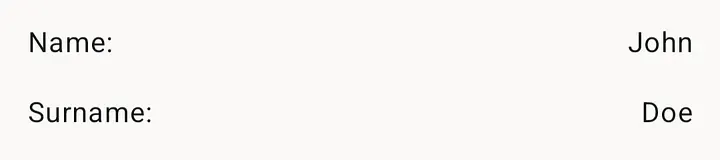
By default, TalkBack will treat these as four separate texts. In order to tell it to read the rows together, we can add the modifier semantics(mergeDescendants = true) to the root of the row:
Row(
    modifier = Modifier
        .fillMaxWidth()
        .semantics(mergeDescendants = true) {},
    verticalAlignment = Alignment.CenterVertically,
    horizontalArrangement = Arrangement.SpaceBetween,
) {
    Text(
        text = "${key}:",
    )
    Spacer(modifier = Modifier.width(16.dp))
    Text(
        text = value,
        textAlign = TextAlign.Right
    )
}
Some components are automatically merged together: For instance, if there is a clickable modifier on a component, all the descendants of that component are merged out of the box. Same holds also for toggleable, selectable modifiers (Notice we didn’t have to explicitly set mergeDescendants to true in the radiobutton example above)
clearAndSetSemantics
Sometimes, besides merging a component, we might also want to set a custom contentDescription to the component. Check out this weather forecast example:
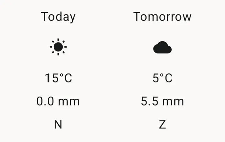
In this example, similar to the previous one, I would like to merge the forecast for a day (so that they are read out together). I also need a contentDescription for the icons (like sunny, rainy, cloudy..). That is probably enough to make it acceptable, but suppose I want to make this more clear: Instead of concatenating the labels of its children, I want it to read the forecast as “Today is sunny. Maximum 15 degrees celcius. No rain expected. Wind direction: north”. We can do this using the clearAndSetSemantics modifier on the root of the component. This modifier clears individual semantics of its children and replaces it with the given semantics:
Column(
    modifier = modifier
        .clearAndSetSemantics {
            contentDescription = buildContentDescriptionForForecast(dailyForecast)
        },
) { .. }
(Note that although it is nice to make things as clear as possible, we should also keep it as concise as possible, because there might be users who are reading these with a braille display, instead of Talkback. It is up to you to find a reasonable trade off between clarity and conciseness.)
stateDescription and liveRegion
Sometimes an action on an item might change the value of another component, which is not currently focused. Let’s take this counter example, with two buttons and a text in the middle:

Suppose the user is repeatedly clicking on the plus icon. They don’t know which number they have reached, without moving back to the text and checking it out. It would be better to give them feedback about the current state, each time they click on the button.
One possible solution is to attach a stateDescription parameter to the plus and minus buttons:
IconButton(
    modifier = Modifier.semantics {
        stateDescription = "$count"
    },
    onClick = {
        count--
    }
) {
Now each time the user clicks on it, TalkBack will also express the current state (count).
Another way to solve the same issue is by setting the number text as liveRegion. Setting a component as live region, tells TalkBack that this text should be read again if it changes.
Text(
    modifier = Modifier.semantics {
        liveRegion = LiveRegionMode.Assertive
        contentDescription = count.toString()
    },
    text = count.toString(),
)
Now each time the value of this text changes, TalkBack will state that out loud, even if it is not currently focused.
heading()
When you navigate within a long list of blocks or a long article, you sometimes scan the titles or subtitles, with your eyes before starting to read, right? TalkBack users can also do something similar by navigating between headings. But to make it possible, you need to label your titles as headings:
Text(
    modifier = Modifier.semantics {
        heading()
    },
    text = title,
    ...
)
CustomAccessibilityAction
Sometimes an action might be impossible or difficult to achieve in TalkBack mode. For instance, swipe-to-delete, or drag-and-drop.. Or a fab button might be too difficult to reach by swiping to next. Or clicking out of a pop up menu for closing it might seem obvious for you, but maybe a close button would work better for a TalkBack user? In such cases, we might need to provide an alternative for TalkBack users. One way of doing this, is to programmatically check if the device is in TalkBack mode, and replace a component with another one. Here is an extension we can use to check if the device is in TalkBack mode:
fun Context.isAccessibilityEnabled():Boolean {
    val accessibilityManager = getSystemService(Context.ACCESSIBILITY_SERVICE) as AccessibilityManager
    return accessibilityManager.isEnabled && accessibilityManager.isTouchExplorationEnabled
}
And then we can use it like:
if (context.isAccessibilityEnabled()) {
    // Add a button here only for Talkback users
}
Another way is adding custom accessibility actions to a component. For instance, for a list item that is normally deleted by swipe, we can add a custom accessibility action as follows:
Row(
    modifier = Modifier
        .clickable {
            onItemClick(item)
        }
        .semantics {
            customActions = listOf(
                CustomAccessibilityAction(
                    label = "Delete item",
                    action = {
                        onDelete(item)
                        true
                    }
                )
            )
        }
) {
Now when the item is focused, TalkBack will announce that there are custom actions available on the item.
hideFromAccessibility()
There might be also cases where you prefer to hide something intentionally from accessibility services. A typical example is display ads. These are visuals that you can’t describe with a content description and more importantly, you don’t want your users to accidentally click on those. And yet, as it is a clickable item, it takes focus. In such cases, you can prevent a composable from taking focus by setting hideFromAccessibility() in its semantics:
modifier = Modifier
    .semantics {
        hideFromAccessibility()
    }
Where to go next?
I have shared above some tips and tricks for solving common accessibility issues with TalkBack. But of course there is more to TalkBack then the features above and there is more to accessibility then merely TalkBack.
- You can check out what other semantic properties are available, in case you need them.
- You can check out these tools that can help you test your app for accessibility
- You can check out the docs for an overview of accessibility topics for Compose
Thanks for reading and happy coding!
(Thanks to my colleague Iulia Stana for reviewing)
Ready to make your digital products accessible?
From quick scans to full reports and technical adjustments, let’s explore how we can support your organization.